Background Theme
The Background Theme section in the menu panel lets you personalize the background of the page, including preset background colors, custom images, and other options.
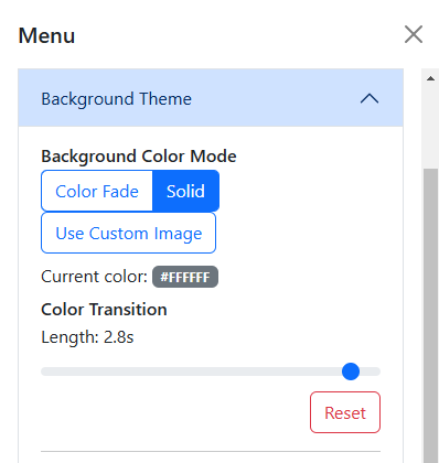
Table of contents
Options
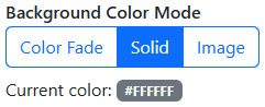
Background Color Mode
The Background Color Mode dropdown menu lets you choose between the Color Fade, Solid Color, and Image modes.
Color Fade
In this mode, the background color fades between a preset list of colors, with a default interval of 2.8 seconds.
In order, these colors are:
#FFC0CB- Pink#FFD700- Gold#7FFFD4- Aquamarine#FFA500- Web Orange#9370DB- Dull Lavendar#00FFFF- Cyan#E969B4- Deep Blush#8BCE25- Atlantis#40E0D0- Turquoise#FF7C4C- Coral#DA70D6- Orchid#00FA9A- Spring Green
This is the function that handles the Color Fade mode:
export function startColorFade() {
    logConsole('Color fade started', 'info');
    const colors = {
        'Pink': '#FFC0CB',
        'Gold': '#FFD700',
        'Aquamarine': '#7FFFD4',
        'Web Orange': '#FFA500',
        'Dull Lavender': '#9370DB',
        'Cyan': '#00FFFF',
        'Deep Blush': '#E969B4',
        'Atlantis': '#8BCE25',
        'Turquoise': '#40E0D0',
        'Coral': '#FF7C4C',
        'Orchid': '#DA70D6',
        'Spring Green': '#00FA9A'
    };
    const colorNames = Object.keys(colors);
    let currentIndex = 0;

    // Initial color update
    bodyElement.style.backgroundColor = colors[colorNames[currentIndex]];

    const fadetime = menu.fadetransrange.value; // Get fade transition length value when restarted
    bodyElement.style.transition = `background-color ${fadetime}s ease-in-out`;
    menu.colorbadge.textContent = colors[colorNames[currentIndex]]; // Initial color badge update

    fadeIntervalID = setInterval(() => {
        currentIndex = (currentIndex + 1) % colorNames.length;
        const currentColor = colors[colorNames[currentIndex]];
        bodyElement.style.backgroundColor = currentColor;
        menu.colorbadge.textContent = currentColor;
        setMetaColor('color', currentColor);
        logConsole(`Fade background color to: ${currentColor}`, 'debug');
    }, 3000);
}
Solid Color
When Solid Color Mode is selected, you can choose between 33 preset background colors.
Here’s the list of all the built-in preset colors: (Skip to Image section)
Basic Colors
#FF0000- Basic red#FFA500- Basic orange#FFFF00- Basic yellow#00FF00- Basic green#0000FF- Basic blue#FF00FF- Basic magenta#FFFFFF- Basic white#808080- Basic gray#000000- Basic black
Bright Colors
#F2B5D4- Pale pink#C2E0E9- Pale blue#E1D5E7- Lavender#B0E0E6- Powder blue#F7D5AA- Pale peach#D5E8D4- Mint green#92A8D1- Periwinkle blue#E6AF75- Apricot#D9B5A5- Dusty rose#9AC1B7- Seafoam green#D0B9C3- Mauve#C4B7D9- Lilac
Dark Colors
#D72C6F- Deep pink#227FBF- Deep blue#7E3F9D- Deep lavendar#367F89- Deep powder blue#FF713F- Deep peach#549F55- Dark mint green#2B4771- Deep periwinkle blue#C55324- Deep apricot#954A3E- Deep dusty rose#457E70- Deep seafoam green#8B2C5A- Deep mauve#7C5793- Dark lilac
The color names were sourced from Name that Color and other sources.
When a preset color is selected and Text Color Override is disabled, the color of the clock display dynamically changes between black and white based on the luminance of the selected color.
Essentially, if the luminance of the selected color is greater than 62%, the text color will be set to black. Otherwise, the text color will be set to white.
Image
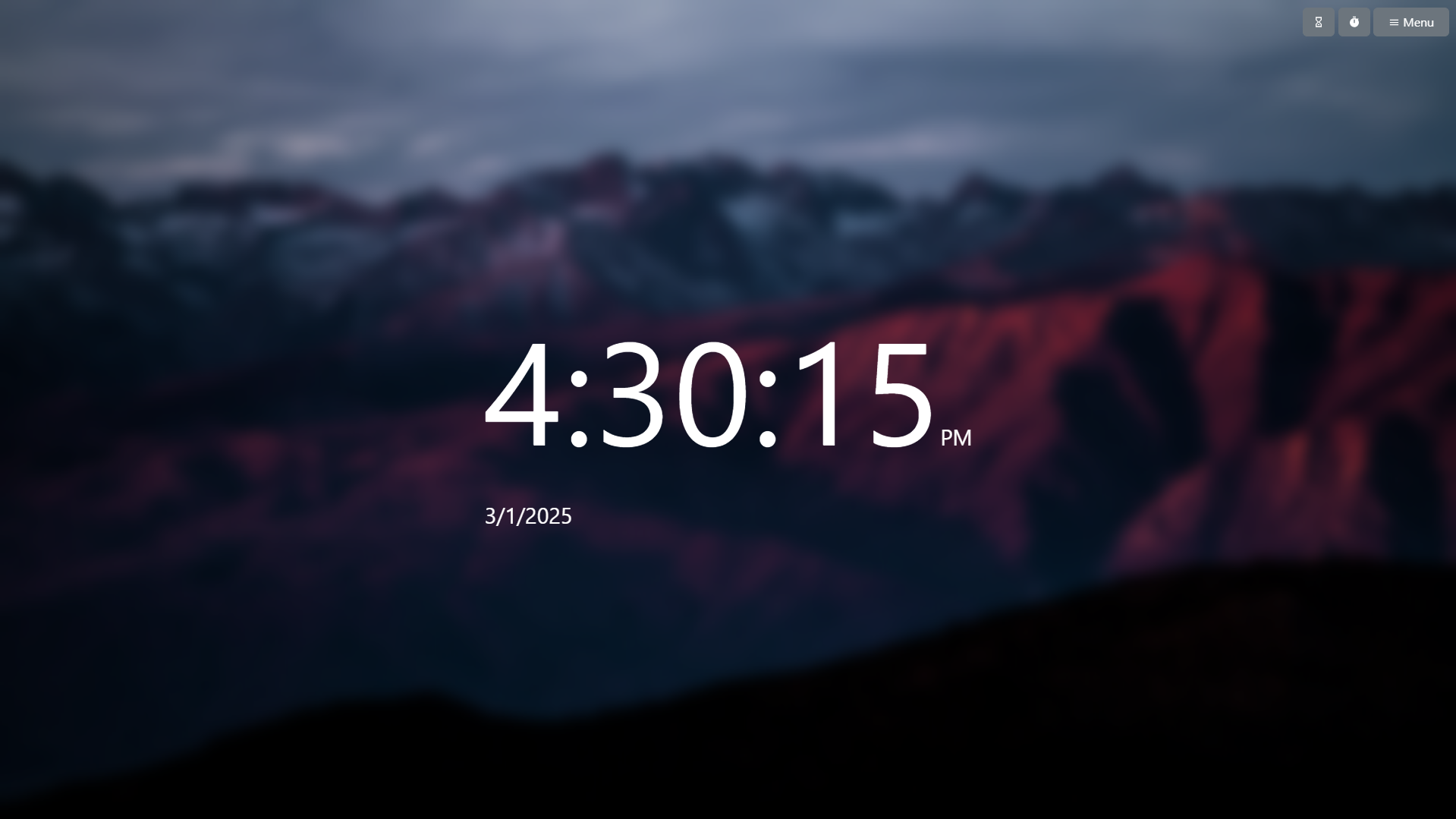
Here you can set a custom image as the background. You can use whatever image file type is covered by the data:image URI scheme, including but not limited to PNG, JPG, and GIF. (Yes, you can set an animated background!)
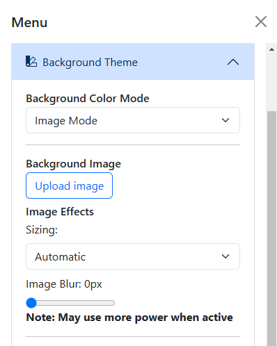
You can also mess with some sizing effects for the background image. You may choose Automatic, Cover, or Stretch, all of which are explained in the MDN Web Docs.
The Image Blur slider lets you blur the background image, possibly to enhance clock visibility.
Because of the way the blur effect is rendered, it may cause the page to continuously use more GPU resources when enabled. Make sure you have hardware acceleration enabled! If you notice performance issues, consider lowering the blur value or disabling it entirely.
Current Color and Transition
The Current Color badge shows the hex value of the current background color. It will change when the Color Fade mode is enabled and when a preset color is manually selected.
The Color Transition slider lets you set the duration of the CSS transition property when the background color changes. It defaults to 2.8 seconds, but can be changed to any value between 0 and 3 seconds.
Just like the Current Color badge, the transition is visible when using the Color Fade mode or when a preset color is chosen.
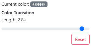
Changing the value of the Color Transition slider will not change the interval of the Color Fade mode. It is limited to 3 seconds max, as that is how often the Color Fade mode cycles through colors.
This setting is affected by your system’s reduced motion preferences. If you have reduced motion enabled, the color change will be instant (no transition) regardless of this setting.
Text Color
The Text Color Override and the Text Color picker options let you change the color of the clock display. They are only visible when in Solid or Custom Image mode.
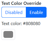
Text Color Override is forced enabled when in Image mode, but can be freely toggled in Solid mode.